

Templates are used to create rich, structured email messages in Activity Messenger.
They let you design the layout, visuals, and content of a message once, then reuse that structure across multiple sends, automations, and campaigns.
This guide explains what templates are, how they’re built using content blocks, and how templates fit into your communication workflow.
Covered in this guide
-
Template Creation Interface: Preview, Publish, Send, and Actions
- Creating a New Message from a Template
➡️ This guide is part of Communications 104: Message Assets, which explains the core building blocks used to create and send messages in Activity Messenger.
1. What Templates Are
Templates are responsive HTML message assets used primarily for email. They define the layout and structure of a message, while allowing content to be personalized at send time using placeholders.
🧩 Pattern: Reusable Message Blueprint
Templates define how a message looks and is structured, but not who receives it or when it is sent.
A template is not a message sent directly to recipients. It is a reusable blueprint that can be:
-
Reused across multiple sends
-
Duplicated to create variations
-
Published as a web page
-
Inserted into automations
Templates are especially well suited for:
-
Newsletters
-
Marketing emails
-
Announcements
-
Automated communications
Template Capabilities
Templates support:
-
Responsive HTML layout (desktop, tablet, mobile)
-
Text, images, buttons, videos, Zoom links, and certificates
-
Merge fields for personalization
-
AI-assisted text generation, tone adjustment, and translation
Templates can be sent by email or SMS. When sent by SMS, recipients receive a link that opens the message in a web browser.
Block Layout Model
Templates are built as a vertical stack of blocks:
-
Header block – logo and branding
-
Content blocks – the main message content, arranged by drag and drop
-
Footer block – legal and contact information
This block-based model ensures clarity, consistency, and mobile responsiveness.
Header and Footer Blocks
Header block
-
Includes your organization logo, which links to the website set in your Organization settings
-
Can be shown or hidden
-
Can be replaced with a full-width image or logo
Footer block (mandatory)
Includes:
-
Copyright notice
-
Organization contact details
-
Social media links
-
Unsubscribe link (for marketing communications)
Header and footer settings are managed globally in your organization configuration.
➡️ These settings are covered in Identity and Branding.
2. Creating a New Template
-
Go to Communications > Templates > + Create
-
Select a template sample (e.g., newsletter) or start from scratch
-
Customize blocks and content
Template samples provide a starting structure and example content. You can freely modify or remove any block.
3. Adding and Editing Content Blocks
Content blocks can be added, reordered, and edited at any time while designing a template.
Adding Blocks
You can add a block using either method:
-
Click the (+) button above the footer to add a block at the end of the template
-
From an existing block, open the Block Actions menu (⋮), then select + before or + after
Duplicating Blocks
To reuse an existing block:
-
Open the Block Actions menu (⋮) on the block, then click Duplicate
Rearranging Blocks
-
Drag and drop blocks to change their order within the template
Editing Blocks
-
From an existing block, open the Block Actions menu (⋮), then click Edit
💾 Templates auto-save continuously, so all changes are preserved automatically.
4. Types of Content Blocks
When you add a block to a template, the block creation interface opens. Each block type is represented by an icon.
The list below matches the numbered elements shown in the interface screenshot and explains how to use each block type.
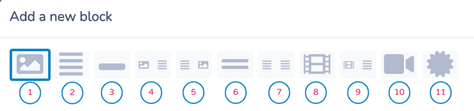
Available block types include:
(Click title to jump to its description)
1. Full-Width Image
Displays a single image spanning the full width of the message. This block is ideal for banners, headers, and strong visual emphasis at key points in your communication.
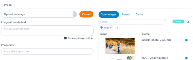
Adding an Image
You can add an image from multiple sources.
Option 1: Upload from Your Computer
-
Click the ... menu to select a file from your computer, or drag and drop a file into the Upload an image area
-
Uploaded images are automatically stored in your Media catalog
Option 2: Select from the Media Library
Open the Media library to choose from the following sources:
-
Your Media catalog
-
Browse or search images using tags
-
Image tags are managed in the Media section (see Media below)
-
-
Pexels
-
Access a library of royalty-free images
-
-
Canva
-
Create or edit images directly in Canva
-
Images are imported automatically through the integration
-
If not already connected, you’ll be prompted to sign in to Canva
-
Image Options
After selecting an image, you can configure additional options:
-
Image alternate text (alt text)
Improves accessibility and can also be used as a prompt for AI-generated image suggestions.
Tip: Use clear, descriptive language (e.g., “children swimming in an indoor pool”) for better results. -
Image link
Add a URL so recipients are redirected when they click the image.
Image Guidelines and Best Practices
Images are stored on Activity Messenger’s CDN (Content Delivery Network) to ensure fast and reliable delivery.
Recommended sizes:
-
Full-width images: 1200 × 600 px
-
Two-column images: 270 × 270 px
You can vary image height, but keeping widths consistent ensures optimal rendering across devices and email clients.
🧩 Reusable Media Asset
All images are managed through the Media catalog and can be reused across templates, messages, forms, and certificates.
2. Single-Column Text
The Single-Column Text block is used to add written content to your template. It supports rich text formatting and optional buttons, making it the most versatile block for conveying information.
Use this block for:
-
Announcements and explanations
-
Instructions or reminders
-
Section headers and body text
-
Personalized messages using Placeholders (merge fields)
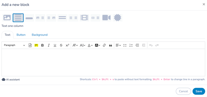 Text and Personalization
Text blocks support rich formatting, including headings, lists, colors, and links. All content is automatically converted to responsive HTML to ensure consistent rendering across devices and email clients.
You can insert placeholders (merge fields) to personalize content with recipient-specific data such as first name, activity details, or dates.
For a complete list of available placeholders—and instructions for creating custom ones—refer to Customizing Messages with Placeholders.
For guidance on formatting tools and editor behavior, see Understanding the Rich Text Editor.
AI Assistance
The text editor includes AI-powered tools to: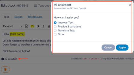
-
Adjust tone (e.g., formal, friendly)
-
Generate alternative text versions
-
Translate content into multiple languages
These tools are available directly within the text editor.
Buttons and Background
Within the same block, you can also:
-
Add a call-to-action button (configured in the Button tab)
-
Customize the background color of the block (via the Background tab)
Buttons automatically use your brand colors and can link to forms, web pages, documents, or surveys.
(Button behavior is covered in detail in the Single Button section.)
🧩 Primary Content Block
The Single-Column Text block forms the backbone of most templates and is often combined with images, buttons, and personalization to create clear, engaging messages.
3. Single Button
The Single Button block is a standalone call-to-action used to highlight a primary action, such as Register or Book now.
Buttons:
-
Automatically use your brand colors defined in Branding
-
Can link to:
-
Forms
-
Web pages (including Microsite pages)
-
Documents
-
An email address or phone number (for Contact Us–style actions)
-
An .ics calendar file to add class schedules to the recipient’s calendar
-
A Pay now action for invoice settlement
-
-
Are designed to draw attention and encourage interaction
Use this block when you want a single, focused action without surrounding content.
Example
At the end of a session, add a button linking to a survey form for participants to complete.
Button labels are fully customizable (e.g., “Book Your Ticket”, “Take the Survey”).
🧩 Primary Call to Action
Use a Single Button block when one action matters more than everything else in the message. It works best when visually separated from surrounding content to reduce distraction and increase clicks.
4. Image Left / Text Right
A two-column layout with an image on the left and text and/or buttons on the right.
5. Text Left / Image Right
A two-column layout with text and/or buttons on the left and an image on the right.
6. Spacer
The Spacer block adds vertical spacing between content blocks to improve readability and visual rhythm within a template.
Use this block to:
-
Separate sections of content
-
Create breathing room between images and text
-
Improve scanability, especially on mobile devices
-
Optionally display a horizontal divider line
Spacer Options
You can configure the spacer using the following settings:
-
Line thickness
Set to0for spacing only, or increase the value to display a horizontal divider line. -
Line color
Choose a color for the divider line, or leave it transparent for spacing only. -
Margins
-
Top and bottom margins control vertical spacing
-
Left and right margins control the width of the divider line
-
7. Two Columns
A flexible two-column layout containing text and/or buttons in each column.
8. Video
The Video block embeds a video from your Media library, YouTube, or Vimeo. In emails, the video appears as a clickable preview that opens the video in a web browser. In SMS messages, it will show up as a shortened link.
Use this block to:
-
Share training or instructional content
-
Promote events or programs
-
Add richer media without overloading the message
Video Configuration
Video blocks use a configuration flow similar to Image blocks.
You can:
-
Select a video from your Media library
-
Link to a YouTube or Vimeo video
-
Add an optional link destination when the preview is clicked
For details on uploading, editing, and managing videos, refer to the Media section below.
9. Video Left / Text Right
A split layout combining a video on the left with supporting text on the right.
10. Zoom Meeting
Inserts Zoom meeting details into your message, including the access link and connection information.
Use this block to:
-
Share online class or meeting access details
-
Provide a clear, clickable entry point to a Zoom session
-
Reduce confusion by centralizing meeting information in one place
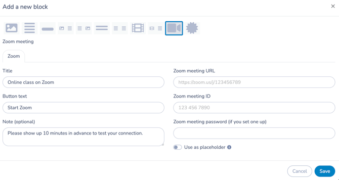 Zoom Meeting Details
You can configure the block with the following information:
-
Title
A short label describing the session (e.g., Online class on Zoom). -
Button text
The call-to-action shown to recipients (e.g., Start Zoom, Join meeting). -
Zoom meeting URL
The direct link to join the meeting. -
Zoom meeting ID
Displayed for users who prefer to join manually. -
Zoom meeting password (optional)
Included if your meeting requires one. -
Optional note
Additional instructions for participants (e.g., Please join 10 minutes early to test your connection). - Use as placeholder
Allows the Zoom Meeting block to remain dynamic and reusable.
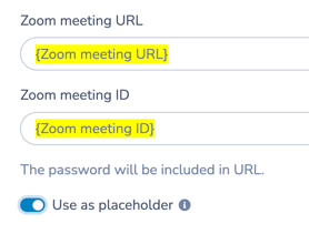 When enabled:
- The Zoom meeting URL and ID are populated using placeholders
-
The actual meeting information is resolved at send time
-
The same template can be reused for different Zoom sessions, classes, or events
When disabled:
-
The Zoom meeting details are static
-
Every recipient receives the exact meeting information defined in the block configuration
🧩 Reusable Live Session Pattern
Enable Use as placeholder when your template is used for recurring or scheduled Zoom sessions. This keeps the template flexible and avoids duplicating templates for each new meeting.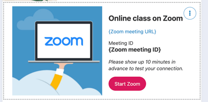
11. Certificate
The Certificate block inserts a personalized certificate into your message. Certificates are generated automatically at send time using placeholders (merge fields).
When configuring this block:
-
Select a certificate from the dropdown list
-
Filter certificates using tags applied in the Certificates section
Each recipient receives a version of the certificate with personalized data filled in automatically.
➡️ For a complete guide, including how to create, customize, and send certificates, refer to Creating and Sending Personalized Certificates.
🧩 Personalized Artifact
Use the Certificate block when you want to deliver a formal, data-driven document—such as a completion certificate or report card—directly within a communication.
5. Testing and Publishing
Before sending a template, always test it against the list you intend to use to ensure placeholders resolve correctly and the layout displays as expected.
Test Placeholders
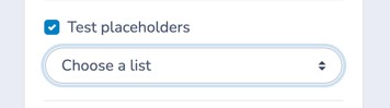
Use the Test placeholders option to validate personalization:
-
Enable Test placeholders
-
Select the appropriate list from the dropdown
-
Review how placeholders are replaced with real data for a sample recipient
This helps identify missing data, formatting issues, or incorrect placeholders before sending.
6. Template Creation Interface: Preview, Publish, Send, and Actions
Once your template is ready, the template creation interface lets you validate, distribute, and manage it from a single place.
From this interface, you can:
-
Preview the template
-
Publish it as a web page
-
Send it as an email or SMS
-
Edit metadata such as subject and tags
-
Perform template management actions
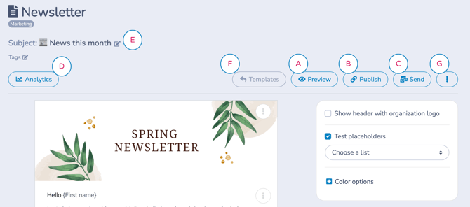
A. Preview
Use Preview to validate how your template will appear before it is used or distributed.
You can preview the template: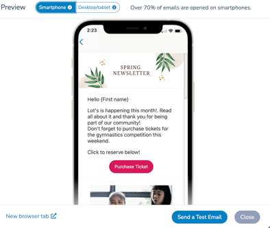
-
On smartphone, tablet, or desktop
-
In a new browser tab
-
With placeholders replaced using test data (when Test placeholders is enabled)
-
By sending a test email to yourself
Preview is a verification step, not a distribution method. It allows you to confirm layout, personalization, and rendering before publishing or sending.
B. Publish
Publishing a template generates a public web page version of the message.
Once published: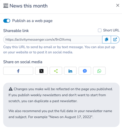
-
A shareable link is created
-
The page can be:
-
Shared by email or SMS
-
Posted on social media
-
Embedded on your website
-
Used as a landing page or permanent reference outside of email and SMS
-
Any changes you make to the template are reflected automatically on the published page.
Best Practices for Published Templates
-
Duplicate past newsletters instead of starting from scratch for recurring communications
-
Include the full date in the template name and subject for clarity and archiving
Example: “News on August 17, 2025”
🧩 Web-First Distribution
Use Publish when your message needs a stable, shareable URL that lives beyond a single email or SMS send.
C. Send
Use Send to deliver the template as an email or SMS message:
-
Select recipients (lists, individuals, or dynamic selections)
-
Choose the sending method (e.g., marketing email with unsubscribe)
-
Optionally schedule delivery for a later date
Best Practices Before Sending
Before publishing or sending your template:
-
Test all placeholders (merge fields)
-
Preview the message on desktop, tablet, and mobile
-
Send one or more test emails to verify inbox rendering
Taking these steps ensures your message looks correct and personalizes properly for every recipient.
D. Analytics
You can also access Analytics from the template interface to review performance data such as opens and clicks once the message has been sent.
Analytics are covered in detail in Communications 106.
E. Edit Subject and Tags
From the template header, you can:
-
Edit the email subject
-
Add or modify tags
Tags help organize templates and make them easier to find and reuse.
F. Back to Templates
Use Back to Templates to return to the template list.
G. Template Actions Menu
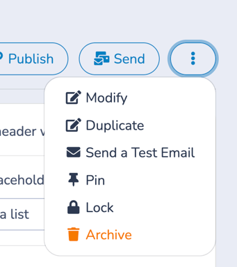
The Template Actions menu (⋮) provides additional options for managing and controlling templates.
-
Modify (Quick edit)
Edit template metadata, including Name, Subject, Communication type, From email, and From display name, without opening the full editor. -
Duplicate
Create a copy of the template to reuse its structure and content. -
Send a test email
Send a test message directly, without entering Preview mode. -
Pin
Pin the template for quick access in the templates list. -
Lock
Prevent further edits to the template.-
Only the Account Owner or an Administrator with the appropriate permissions can unlock a locked template.
-
While locked, the template cannot be modified by other users.
-
-
Archive
Remove the template from active use. Archived templates can be restored.
7. Creating a New Message from a Template
Templates are not sent on their own. To deliver a template, you use it when creating a new message.
Templates are email-first assets. When a Template is sent by SMS, the SMS contains a short message and a link to open the full Template in a web browser.
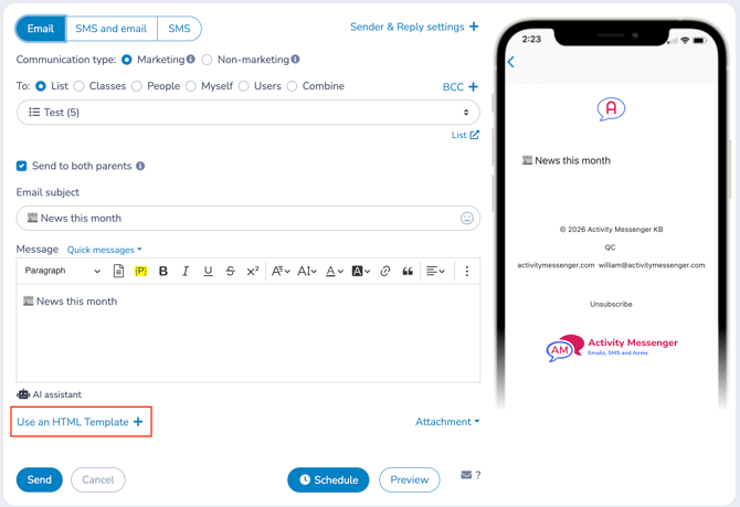
Using a Template in a New Message
To send or schedule a message using a template:
-
Open the New Message interface
-
Follow the steps to define:
-
Channel (email or SMS)
-
Communication type (marketing or non-marketing)
-
Sender and reply settings (optional)
-
Audience (lists, individuals, or dynamic selections)
-
-
Click Use an HTML Template
-
Select the template you want to use
Once selected:
-
The subject and message content are automatically populated from the template
-
The template loads into the message creation interface
How the Message Text Box Is Used
When you select a template, the message text box changes purpose depending on the channel you’re sending through.
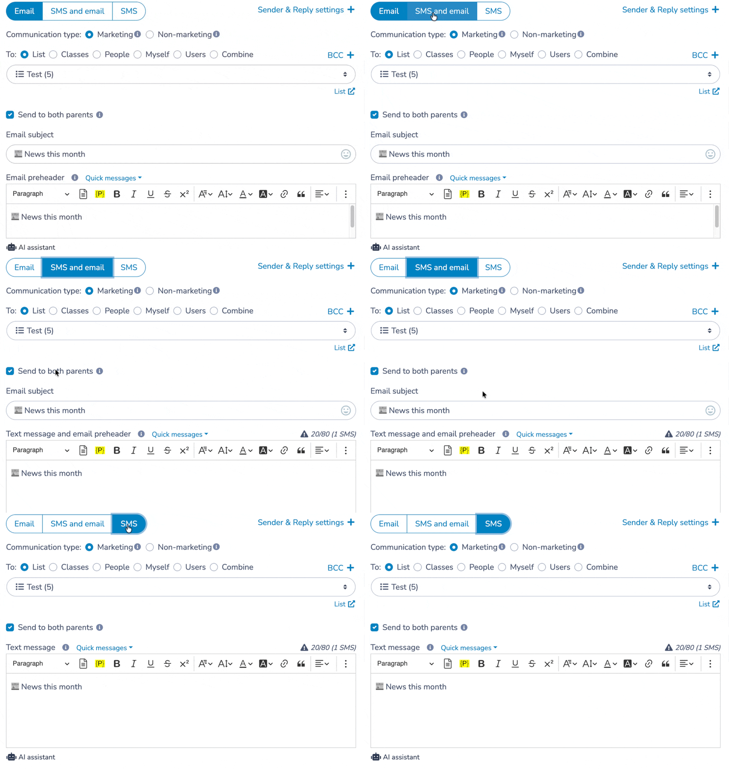
-
The text box becomes the email preheader
-
The preheader is the short preview text that appears next to or below the subject line in inboxes
A good preheader helps recipients understand what the email is about before opening it.
SMS and email
-
The text box serves two purposes:
-
The SMS message
-
The email preheader
-
This allows you to write one short, clear summary that works for both channels.
SMS
-
The text box is your SMS message
-
Activity Messenger automatically appends a shortened link (am.lol/xxxxx) to the message
-
That link opens the full HTML template in a web browser
This keeps SMS messages short while still giving access to the full content.
Adapting a Template for a Specific Message
When creating a message, you may notice an Edit option next to the selected template.
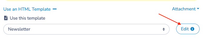
Using this option lets you adapt the template for this message only.
What this means
When you edit a template at message-creation time:
-
A separate, one-time version of the template is created for this send
-
Any changes apply only to this message
-
The original template remains unchanged and reusable
This behavior is the same whether you send immediately or schedule the message.
🧩 Pattern: Duplicate for reuse, adapt for one-time changes
In most cases—especially for scheduled sends—it’s recommended to duplicate your template first, then send from that duplicate.
Why this matters:
-
A duplicated template remains editable up until send time
-
It avoids having to cancel and recreate a scheduled message
-
It provides a clear historical record (e.g. “Newsletter – March 2026”)
⚠️ If you adapt a template inside a scheduled message and later need to make changes, you can no longer edit your message. You’ll need to cancel the scheduled send and start over.
When to use this
Adapting a template for a specific message is ideal when you want to:
-
Make small wording or layout adjustments
-
Update dates, links, or sections for a particular send
🧩 One-Time Adaptation
Adapting a template for a single message lets you customize it just enough for a specific delivery—without breaking or overwriting your reusable base template.
Previewing and Testing
After loading the template into your message:
-
Use the Preview panel on the right to review the message layout
-
Click Preview to test placeholders using a specific recipient list
-
Verify that personalization resolves correctly (names, dates, activity details)
-
Confirm rendering on desktop and mobile views
- Send a test message to yourself to review the final result in an inbox
This step helps you catch layout, formatting, or personalization issues before sending or scheduling the message.
Sending or Scheduling
Once you’ve validated the message:
-
Click Send to deliver it immediately, or
-
Click Schedule to send it at a later date
The template remains unchanged and can be reused for future messages.
🧩 Structure vs Delivery
Templates define what the message looks like.
Messages define who receives it and when.
➡️ These steps are covered in detail in Communications 103: Creating and Sending Messages, which explains the New Message interface and delivery options in depth.
Related guides
-
Communications 103: Creating and Sending Messages
-
Communications 104: Message Assets
-
Quick Messages
-
Media Library and Media Management
-
Creating and Sending Personalized Certificates
-
Customizing Messages with Placeholders
-
Understanding the Rich Text Editor
-
Messaging Default
-
Sending Emails from Your Own Domain